Stand in front of a soap display for sixty seconds. Not to shop just to watch. You’ll notice something that didn’t happen five years ago. People pick things up, turn them over, study the box, put it back. Sometimes they buy what they picked up. Sometimes they don’t. But the picking up that’s the whole game now. And it almost always starts with packaging.
The soap market in 2026 is brutally crowded. Handmade brands, private-label lines, legacy names, and boutique newcomers are all fighting for the same few seconds of attention. In that environment, packaging stopped being a finishing touch a long time ago. It became strategy.
So what’s actually moving the needle this year? And what’s quietly bleeding sales from brands that haven’t caught on yet?
The Window Has Earned Its Place
If there’s one shift worth paying close attention to right now, it’s how consumers relate to product visibility. They want to see what they’re buying. Not a photograph on a label, not a color illustration, not the word luxurious printed in gold foil. The actual thing.
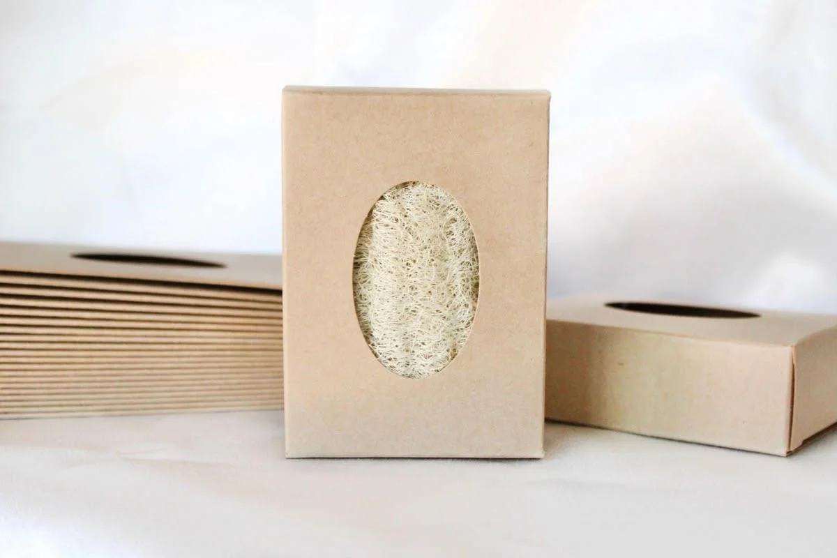
That’s why custom soap boxes with window cutouts have moved from novelty to near-standard among serious soap brands in 2026. A well-executed window does something no amount of label copy can replicate it removes doubt. A buyer can see the real color of the bar, the texture, the embedded lavender buds or swirl of charcoal. It answers questions before they’re asked.
But here’s what separates the brands using this well from the ones who aren’t: execution. A window that’s too small reads as an afterthought. A cheap film that fogs or warps makes a premium soap look like a bargain bin product. The soap boxes designs that are converting in 2026 use precise die-cutting, clean-edge film, and shapes arched, oval, offset rectangles that feel considered rather than functional. The window becomes part of the visual identity, not just a hole in the cardboard.
Artisan and handcrafted brands in particular should be leaning into this harder than most are. If your soap is beautiful and most handmade soap genuinely is hiding it inside a closed box is one of the more counterproductive decisions a brand can make.
Minimalism Is Still Winning But It’s Getting More Demanding
The word minimalism gets used so loosely in packaging circles that it’s almost lost meaning. In 2026, the version that’s actually working isn’t just less stuff on the box. It’s restraint with intention.
There’s a difference between a design that’s clean because everything unnecessary was removed, and a design that’s sparse because no one could figure out what to put on it. Buyers feel that difference even when they can’t name it. Real minimalism in soap packaging right now means one strong typographic choice, a color palette with actual reasoning behind it, and breathing room that makes what’s there feel deliberate.
Brands that get this right aren’t necessarily spending more on design. They’re spending more time on it asking harder questions about what actually needs to be said on the outside of the box versus what can live on a website, an insert card, or a social page.
Sustainable Packaging Has Graduated Past the “Apology Phase”
For years, choosing eco-friendly packaging felt like choosing a lesser option. Kraft board was rougher. Recycled stock didn’t print as crisply. The implicit message was: we care about the planet, please forgive us for the aesthetic step-down.
That’s over. In 2026, sustainable materials are being used by brands that have no intention of looking humble about it. Embossing on recycled board. Spot UV on Kraft. Hot stamping on seed paper. The techniques that once felt exclusive to premium uncoated stocks have found their way onto eco materials, and the results are genuinely striking.
What hasn’t changed is the consumer’s radar for greenwashing. Vague language eco-conscious, sustainably inspired, green packaging reads as noise now. Specifics land: the percentage of post-consumer recycled content, whether the box is home compostable, whether the film on a window panel is plant-based. Shoppers who care about this check. And in 2026, more of them care.
What’s Quietly Hurting Brands
The stock box with a custom sticker has had its run. It made sense when small brands had no affordable alternative. That reality has changed. Minimum order quantities for custom printed boxes have dropped significantly, and the production timelines have shortened. Choosing a generic box with a label in 2026 isn’t a budget decision anymore it reads as a branding one, and it reads poorly.
Overcrowded labels are another quiet revenue leak. The instinct to include every ingredient, every claim, every badge, every social handle on the main panel is understandable. It’s also counterproductive. When a buyer has to work to read a box, they usually put it down. The brands performing best right now are the ones that lead with one clear message and let everything else follow somewhere less prominent.
And then there’s novelty for its own sake unusual shapes, elaborate structures, packaging that photographs beautifully and falls apart in a tote bag. It’s a common trap for brands that grew their audience online before they had a solid retail presence. What works in a flatly doesn’t always survive contact with the real world?
The Through Line
The packaging that’s working in 2026 doesn’t feel like packaging. It feels like the brand made a series of quiet, confident decisions and stood behind them. That’s what a customer is responding to when they pick something up off a shelf and decide, before they’ve read a single word, that it’s worth their time.
Getting there takes more than following trends. It takes knowing why each choice was made and being willing to cut the ones that aren’t earning their place.