

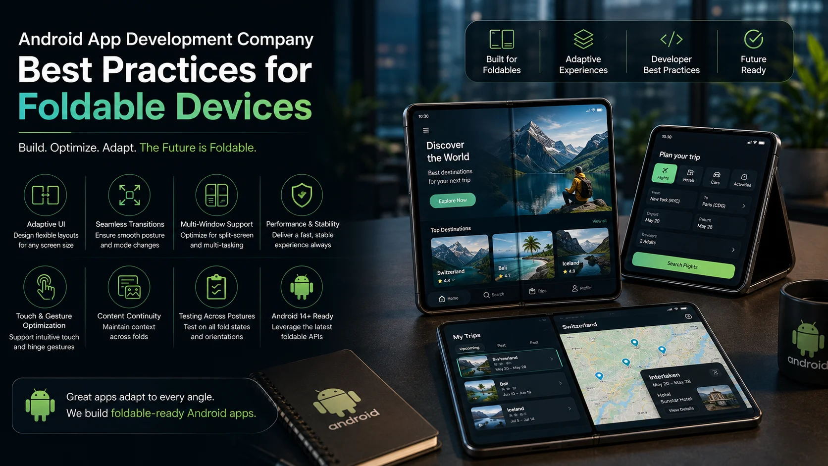
Kenji Watanabe had a problem he couldn’t reproduce on his own phone. His productivity app, a task manager with a sidebar-heavy layout built for tablets, had been getting sporadic crash reports from a cluster of users in South Korea and Germany. The stack traces pointed to a window size class transition, but none of his test devices could trigger it reliably. It wasn’t until a user sent a screen recording from a Samsung Galaxy Z Fold 6 that the issue became visible: opening the app while the device was half-folded, in what Samsung calls Flex Mode, caused the layout system to receive a configuration change the app hadn’t been built to handle.
The window aspect ratio crossed a threshold, the activity tried to recreate itself, and the state restoration logic Kenji’s team had written for conventional phones simply didn’t cover the intermediate states a foldable introduced. Bringing in an Android App Development Company with direct foldable device experience wasn’t a luxury at that point. It was the only realistic path to understanding a problem class that required platform knowledge his generalist team hadn’t had reason to build. What followed was an education in how fundamentally foldables change the assumptions that have governed Android layout development for fifteen years.
Understanding the Foldable Device Landscape
Before writing a line of code differently, it helps to understand what foldable devices actually introduce at the hardware and software level that conventional phones and tablets don’t. The Galaxy Z Fold series, the Pixel Fold, the OnePlus Open, and the growing field of competing book-style foldables all share a core characteristic: they present multiple physical configurations to the operating system, and the transition between those configurations is not always instantaneous or clean.
A book-style foldable in its closed state behaves like a narrow phone. Open, it presents a large inner display with tablet-like proportions. In between, during the folding or unfolding gesture, it passes through states where the hinge angle creates a partially flat posture that neither phone nor tablet logic handles well by default. Flip-style foldables like the Galaxy Z Flip series introduce a different challenge: the Flex Mode posture, where the device is half-folded, splits the display into two distinct zones that applications can target independently or treat as a unified canvas.
The Android platform has extended its window management APIs specifically to address this through the Jetpack WindowManager library, which exposes FoldingFeature information: the hinge position, orientation, state, and occlusion type. Applications that read this information and respond to it can build experiences that feel native to the hardware. Applications that ignore it end up with the kind of layout collision Kenji encountered.
Continuity Across Configuration Changes
The foundational requirement for any foldable-optimized Android app is that configuration changes caused by folding and unfolding don’t destroy user state. On conventional devices, the configuration changes developers typically handle are screen rotation and language changes. Foldables add window size class transitions as a frequent and user-initiated configuration event, one that happens every time someone opens or closes their device.
An app that forces the user to lose their scroll position, their form input, or their navigation state every time the device is opened is an app that foldable users will delete. The solution requires proper implementation of ViewModel for state that should survive configuration changes, onSaveInstanceState for transient UI state that needs to be restored, and a clear architectural boundary between state that belongs to the UI layer and state that belongs to the business logic.
Kenji’s team had built state management that covered rotation but hadn’t accounted for the intermediate window size class states a foldable introduces during the fold transition. The fix required extending their state restoration logic to cover all three WindowSizeClass categories, compact, medium, and expanded, and testing explicitly for transitions between them rather than only testing the stable end states.
Adaptive Layouts With Window Size Classes
Google’s recommended architecture for building layouts that adapt across foldables, tablets, and phones centers on the Window Size Class API. Rather than building breakpoints against pixel dimensions or density-independent units, the API provides three named categories that map to meaningful layout decisions: compact width for single-column phone layouts, medium width for two-pane or side navigation configurations, and expanded width for full desktop-like layouts on large inner displays.
The practical implementation uses Jetpack Compose’s adaptive layout components, including NavigationSuiteScaffold, which automatically switches between bottom navigation, navigation rail, and navigation drawer based on the current window size class. For teams still working in Views, the SlidingPaneLayout and the two-pane layout from the Jetpack library provide equivalent adaptive behavior without a full Compose migration.
A travel booking app that Kenji’s team used as a reference during their remediation had implemented the list-detail pattern correctly for foldables: on a compact phone screen, the destination list and the detail view were separate screens navigated sequentially. On a Fold’s inner display in expanded configuration, both panels appeared side by side, with the list on the left and the detail on the right. The transition between those presentations happened automatically as the device was opened, without any user action required and without any state loss.
Testing Foldable Behavior Systematically
Physical foldable devices are expensive, and not every member of a development team will have access to one during daily development. The Android emulator ecosystem has made meaningful progress here. The best android emulators for foldable testing are the resizable Android Virtual Devices available in Android Studio, which allow developers to simulate different window size classes and even trigger posture transitions programmatically without needing physical hardware. The Foldable emulator profiles in Android Studio replicate the inner and outer display configurations of book-style devices and the Flex Mode posture transitions of flip-style ones.
Physical device testing remains important for anything involving actual hinge behavior, touch input near the hinge area, and camera behavior that varies by posture. But the emulator covers the majority of layout and state management testing scenarios that foldable optimization requires, which makes it accessible to teams at any budget level.
Kenji’s team built a testing matrix that covered eight distinct states for each major app screen: closed phone mode, inner display standard portrait, inner display landscape, Flex Mode top half, Flex Mode bottom half, transition from closed to open, transition from open to closed, and multitasking split-screen on the inner display. Running through that matrix manually for every release was time-consuming, so they automated the window size class transitions using Espresso and the WindowManager test utilities, catching regressions before they reached any device.
Hinge-Aware Layouts and Flex Mode Experiences
The most distinctive user experience opportunity foldables offer is the Flex Mode posture, and most apps ignore it entirely. An app that does nothing with Flex Mode leaves the bottom half of the display blank while the user interacts with the top half, which is functional but feels unfinished on hardware designed to make that posture meaningful.
The Jetpack WindowManager FoldingFeature API exposes the hinge bounds in the window coordinate space, which allows layouts to avoid placing interactive content directly over the hinge area, where touch input can behave unpredictably, and to use the two physical zones the half-folded posture creates intentionally. A video player that moves playback controls to the bottom half and the video to the top half in Flex Mode is replicating exactly the laptop-style posture the hardware is designed to enable. A recipe app that shows the ingredient list on the bottom and the step-by-step instructions on the top lets users interact with the bottom without lifting the device.
These experiences require detecting the FoldingFeature state using a Flow collected from the WindowInfoTracker, updating the layout based on the hinge state in real time, and handling the edge case where the hinge occludes part of the display rather than simply dividing it. The occlusion type field on FoldingFeature distinguishes between a hinge that is fully transparent and one that blocks content, which affects whether content should be shifted away from the hinge bounds entirely.
Multitasking and External Display Considerations
Foldable users are power users by disposition. Someone who spent upward of $1,800 on a Galaxy Z Fold device expects to use it in split-screen, in pop-up view, and potentially connected to an external monitor via DeX. Applications that haven’t declared resizableActivity=”true” and haven’t tested their layouts in multi-window configurations will degrade in all of those scenarios.
The multi-window requirement means that an app’s minimum supported window size becomes practically significant in a way it isn’t on conventional phones. An app that requires 600dp of width to function properly will be letterboxed or broken in a split-screen configuration where it receives less than that. Auditing minimum layout requirements and ensuring that every screen degrades gracefully to compact width, even when the developer’s mental model was always tablet-first, is a necessary step in foldable optimization.
The Compounding Return on Getting This Right
Kenji’s app went from sporadic crashes and poor foldable reviews to being featured in a Samsung Galaxy Store editorial about productivity apps optimized for foldable devices, eight months after the remediation project completed. The feature drove a meaningful install spike from exactly the high-engagement user segment that foldable ownership self-selects for. Those users left longer session times, higher review scores, and lower churn than the app’s existing user base.
Foldable adoption is growing faster than tablet adoption did at the equivalent point in that device category’s maturity. The development teams building genuine foldable experiences now are establishing product reputation and search visibility in a device category that is not yet crowded with well-optimized apps. The practices that support foldable optimization, proper state management, adaptive layouts, posture awareness, and systematic testing, are also the practices that produce better apps on every other Android form factor. The investment compounds in both directions.